Southeastern Show Home: Review & Recap
It was such a honor to be an apart of the opening day festivities, for the Atlanta Southeastern Show House this year. The Southeastern Show Home Review & Recap was open for home tour on April 19th – May 13th, in case you missed it. I also want to highlight a few of the design trends we loved and you will start to see on the horizon.
For the Southeastern Show Home Review & Recap, the past 3 years the annual Southeastern Designer show house & Gardens has been a huge success. This event is produced by Atlanta Homes & Lifestyles and benefits the Atlanta History Center. This year featured 15 talented interior design firms, all from the great southern regions of Atlanta, Charlotte, North Caroline, Charleston, South Carolina, Montgomery, Alabama and Jacksonville, Florida. This year’s Honorary Chair, Beth Webb, organized and lead all of the super talented designers in creating this beautiful and inspirational home.
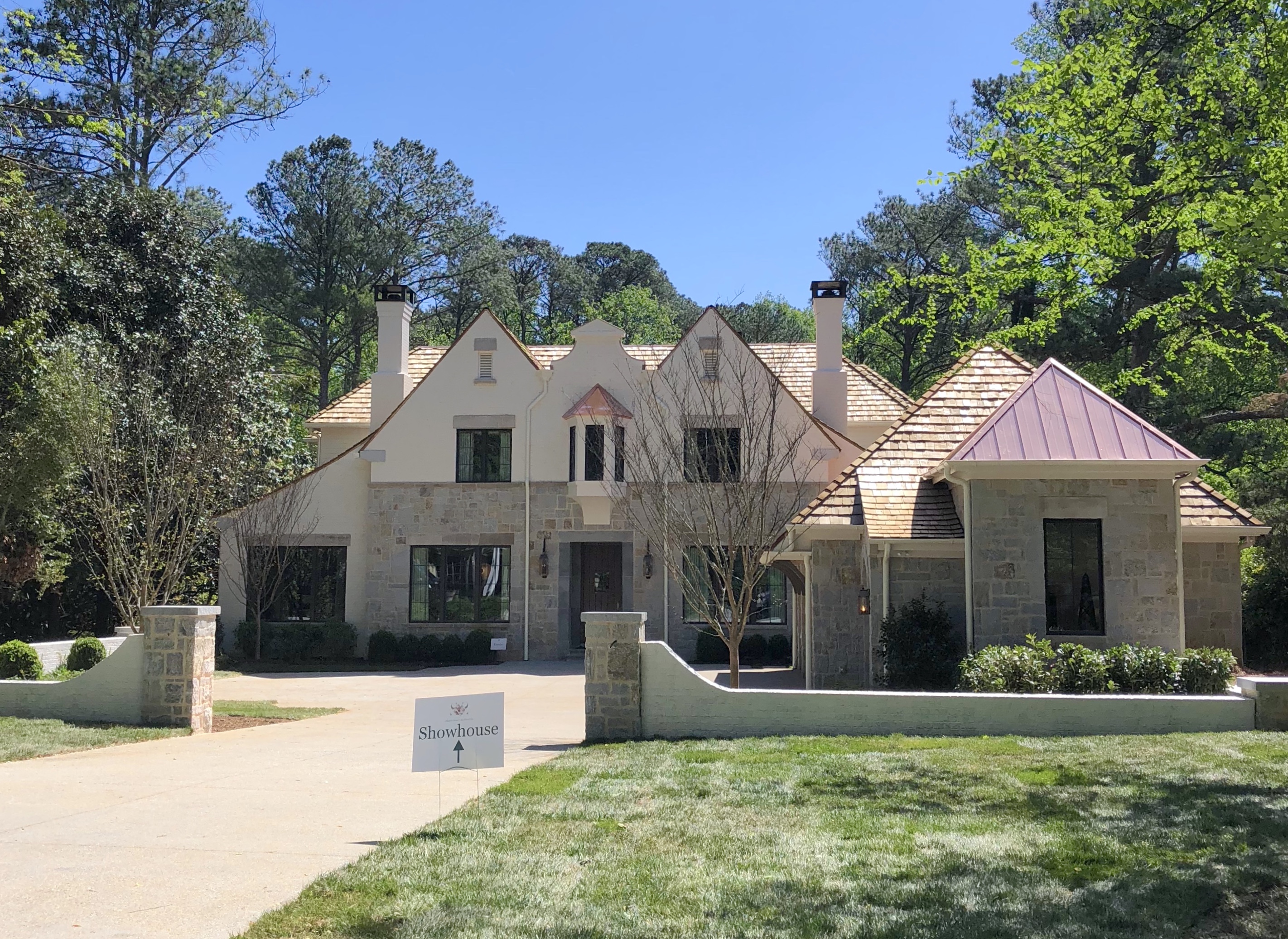
 This newly built home, with a french chateau style elevation is positioned on an unheard of 1.13-acre lot, located inside the perimeter of Atlanta, with a pristine Buckhead zip code. Just take a minute to let all that information soak in. The previous home was purchased and demolished to make room for this crowning jewel of the neighborhood. Which I am told has already sold for around $3.8 million.
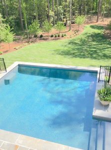
Landscape architects Graham Pittman, Floralis Garden Design, Maxwell Gardens and Hamilton Land Services created a lovely motor court, along with this sprawling terraced lawn, complete with a pool and lush gardens. This area is a complete sanctuary and so vast to be inside the perimeter, at a little over an acre. This sleek gunite pool finish is one of the most sought after pool types in the southeast for its ease of maintenance and gentleness on your feet.
THE OFFICE: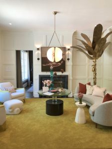 As you enter the home a sophisticated office is located on your left, designed by Tish Interiors. It has been finished with board and batten trim to create a coffered effect on the walls. This classic look has become a very big trend this season and will continue to carry forward here in the south. I have to say we really love our fancy millwork here in the south, it can evaluate any home anywhere and make it look like a million bucks.
 Also, you may notice the use of gold in this room. Gold as a metallic is making a big come back in the world of interior design. All metallics and metals are big but Gold is truly the standard right now. There is also a very mid century modern vibe in this room as well, also another trend that is hitting the radar.
THE STUDY:

Directly off of the office through a small door way is a secluded study designed by R. Hughes. This room has a dark moody secretive quality, which is mimicked in the smokey gray walls and floor to ceiling sheer drapes. I absolutely love the pop of blush pink on the ceiling. Blush is another designer trend you will see a lot of this season thanks to all of the millennial pink flooding the market.
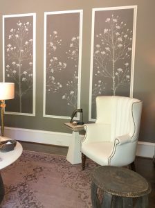 You will notice that the blush pink is also pulled into the art, which is simply framed wallpaper to give the illusion of screens. This is an effect I love and can easily be mimicked in any home so take note. I also absolutely love the layered effect of art placed in front of the large round mirror.
THE DINING ROOM:
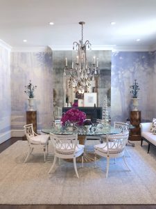
The dining room, is an absolute vision in lilac and designed by Phillip Sides Interior Design. The gorgeous mural style of wall paper is yet another trend we are seeing a lot this year, which I do love even though I am not really a fan of any wallpaper, this is one I can behind. Honestly, wallpaper in general in is really starting to make a come back. I have to say I have not seen this much wall paper in a home since the late 80’s early 90’s.
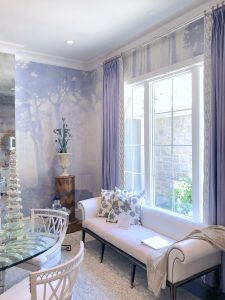
As I mentioned above this a mural style of wall paper, so you will notice that it is more of an actual scene verses a pattern. Yet is has a water color value which makes it less over powering and easier to live with on a daily basis. This particular mural reminds me of a morning walk in the woods with an Instagram filter on your sunglasses.
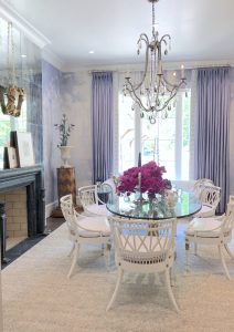 You will also notice the eclectic vibe of mixed mediums in this room. By eclectic, I am referring to the mix of a modern glass table with garden style wicker chairs. Again, you will see the layered metallic influences on the fireplace, curtain rod and chandelier.
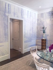
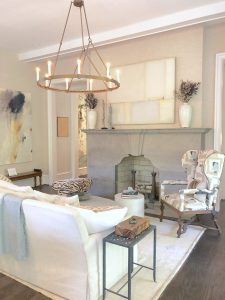
THE LIVING ROOM:
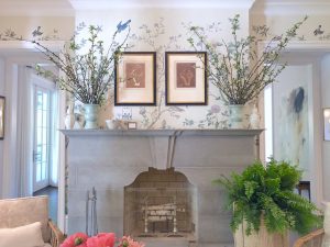
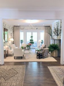 You can see the Living Room directly from the front door and designer Beth Webb of Beth Webb Interiors literally made it a show stopping “living” room. This space feels as if those glorious french doors have been thrown open and you brought the entire garden inside.
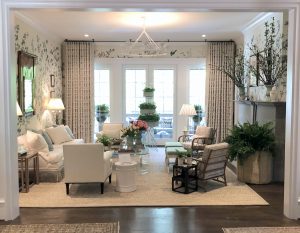
This fantastic handprinted wallpaper by F. Schumacher might set you back $8,000, but I dare you to find the seems. I literally tried and think that my eyes went crossed a few times. This maybe one of the best wallpaper installation I have even seen, so bravo! Just a note, I do not even like wallpaper, just ask my sister, LOL. 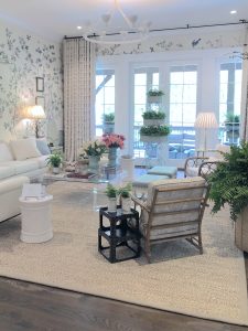 Light and airy will always be in style and you can never go wrong when embracing fresh elements by bringing them into your home. I love the beautiful simple floral design of the hearth and those fantastic river birch logs which are still trending hot this season. Really anything river birch is so uber hot right not, the pattern, texture and color just can not be beat.
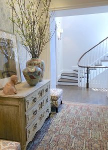
 Beth Webb of Beth Webb Interiors was also the designer of this lovely hallway. To me the shear scale of the hallway made it grand, in and of itself. You can get a feel for its size based upon the two standard sized dressers used as hallway tables.
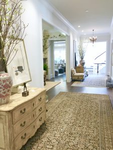 Impressive large art work on easels and ercetyl scared urns filled with what might have been a small dog wood tree completed the look. I absolutely love when a designer gets the scale in a room correct and those trees, are perfection anything smaller would just be understated for the size of this room. Don’t you agree?
THE ENTRY & VESTIBULE :
This spaced joined the back hallway above to the front living and dining rooms. It was designed by Courtney Giles Interiors and was one of my favorite areas in the house. Mainly because of her unique use of ribbon as trim. She was able to join a variety of spaces together with chic neutrality.
 This is a closer look at the ceiling in the vestibule area and a prime example of the ribbon I mention above. This is a 2 1/2″ burlap ribbon attached to the ceiling as a boarder with nailhead tacks the size of a silver dollar. This is a truly ingenious method with a lux look. Bravo!
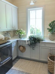
THE KITCHEN & KEEPING ROOM:
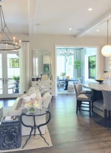
The main space of the kitchen and keeping room was design by Harrison Design. Trends that are still big that you might notice are the ceiling beams, these are just painted white for a more subdued look. Large industrial style light fixtures either with open bulbs or Edison bulbs are still hot. You may also notice the addition of a pet bed located under the kitchen island, a focus on living space for your pets is alway in style.
Natural stone counter tops with exotic or one of kind prints seem to be the direction of the future. We saw a lot of marbles, quartzites and natural products with high design and great durability. Simple and sophisticated = Practical luxury, is the slogan from Pietra that also offers, Antolini Azerocare. The industry’s first ever system that prevents staining and etching of natural stone. That means, when you spill your red wine, you can relax and breathe normally.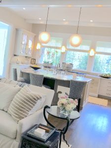 You may also notice the absence of upper cabinets all together in this kitchen with the exception of the built in wall and small desk area. This is a trend stemming directly from open shelving minimalist design, and a focus on natural light. These large scale windows are the primary focus of this space, not hard to reach upper cabinets that will house a bunch kitchen items you may never use. This however also shows the luxury of being able to eliminate the storage space, by having plenty of additional storage in a butlers pantry. This is a way of showing understated luxury via minimalist design and having wide open windows and beautiful views verses much needed or required storage.
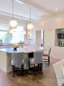
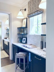
BUTLER’S PANTRY:
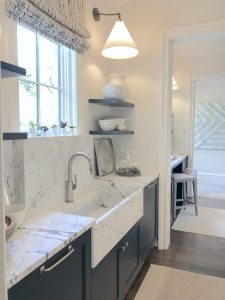 The butler’s pantry was probably my favorite space in the entire house. Designed by Phillip Sides Interior Design it has everything you could possibly want. Supreme functionality with high end beauty, it is a shame to even keep it behind the closed doors in the kitchen. I would want to show this space off all the time. I love the floating shelves, large farmhouse sink and simple roman shade that accents the beautiful Calcutta marble, which is my second favorite marble only after the classic Carrara marble.
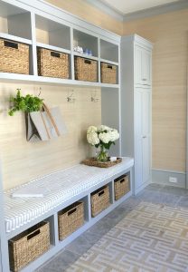
LAUNDRY, POWDER & MUDROOM:
There is still a huge focus on the functional spaces within the home. Helen Davis Interior Design illustrates this in the back of the house mudroom areas complete with a powder room and main laundry room for this home. This area directly off of the butler’s pantry and garage was clearly designed for the ease of house staff to make sure that this manor runs a like a machine. 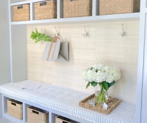 This sweet little drop zone area boost a 4 person line up for shoes, book bag and accessories. It utilizes a linen patterned wallpaper on the walls that is carried into the built in for continuity.
 The large downstairs laundry room carries the same color theme. It also has the top 3 most sought after custom laundry room requests: a window , a designated folding area and a sink.
 To mix things up a bit a large palm leaf pattern wall paper was added to the powder room, but still keeps in the same color story. As you can see this is a very simple yet utilitarian design for the back of house.
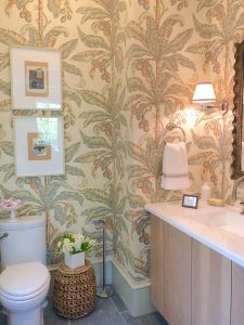
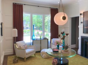
BREAKFAST ROOM:
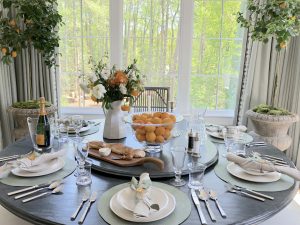
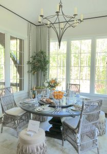 One of my other favorite rooms in the home was the breakfast nook, because I am a sucker for a great tablescape. This simplistic room by The Design Atelier had live orange trees planted in the urns in the corners and a floating piece of art boldly placed over the windows.
 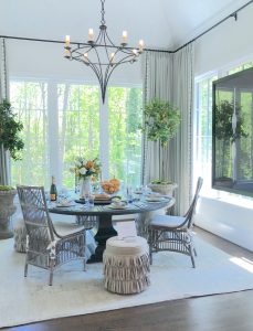 The orange theme was carried to the table with dried orange slices tied with twine for napkins holders. Place cards were names written in gold on the orange leaves. I am totally going to have to retreat this table soon, I can feel it in my bones.
LOGGIA:
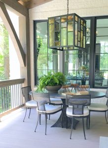 Directly off of the breakfast room with access from the living room and main floor master suite was the Loggia by Mitchell Hill. This fantastic Mary Chandelier by Mitchell Hill is clearly the show stopper. There is also room for sitting by the fire and an over view of the pool.
MASTER ON MAIN:
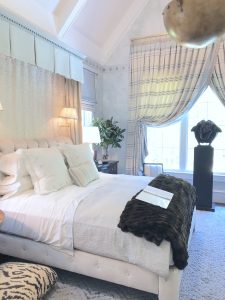 This show house actually had two master suites, this one located on the main floor was designed by James Michael Howard, Inc. A gorgeous lux room that was filled with plenty of texture for the eyes. From fur to silk, bronze to 19th Century French burr-walnut, you name it, it was in this room.
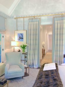
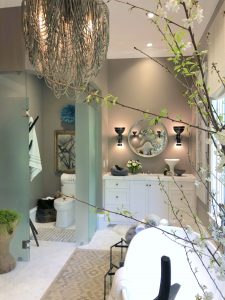
MASTER BATHROOM:
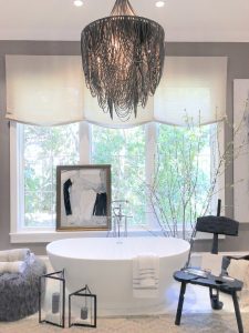 Let me start by saying I love this leather chandelier! It was my favorite thing in the entire house, period, a total steal at$5,180! You go B.D. Jeffries, now this is a master bathroom!
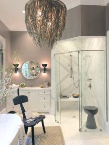 You may notice a lot of current trends used in new and excited ways within this house. This one uses a deep rich Elephant Gray paint by PPG to add drama to the walls; while white cabinets, floors and fixtures create that spa like feeling. I also did notice that most of the showers through out the home offered smooth tile transitions with glass doors, no over flow lips needed anymore.
MASTER SUITE UPSTAIRS:
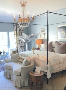 The entire upper master suite was designed by Mathews Furniture + Design. It had a serine world traveler feel. Almost as if you had surrounded yourself with all your prized possessions from around the world.
 A very eclectic mix of themes from the white antique paper mache palms to funky Josh Young custom art hanging over the bed, this room’s theme is no theme at all.
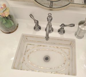
 The master bathroom is very neutral with the beautiful Carrara marble chevron tile and white on white walls, but they decided to pop the closet door with a peppy pink to accentuate the flamingo art on the wall.
 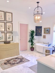 Details can be seen in the sink bowls where a gold filigree was added and we continue to see the use of a a rectangular bowl. Which I tend to worry that this shape will eventually become very dated, but we shall see.
BEDROOM 1/ BATH: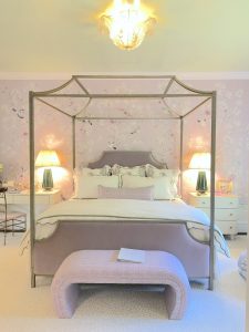
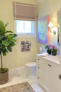
Catherine M. Austin Interior Design created this dreamy room, a vision in sage and lavender. I found something so soothing about this space whether it was the large olive sectional in the corner for reading, the elite vibe of this beautiful bed, or just the the delicate light pink wallpaper.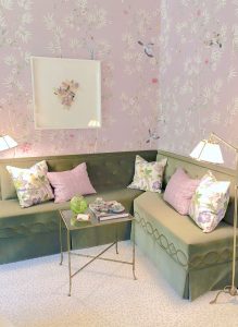 The attached bathroom carried the same color theme into the space. The addition of many live plants and florals continued a fresh vibe into this space. A sweet pop of color comes from a custom made roman shade used to dress the irregular shaped window.
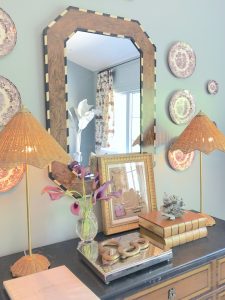
 By far the most unique area of this suite was the gallery created with many personal pieces on loan from Catherine Austin herself. It was a great way to use this otherwise unusable space, in this home. Plus, it gave the room another level of depth.
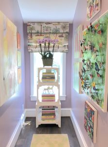
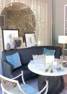
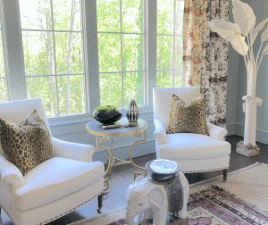
THE SITTING ROOM: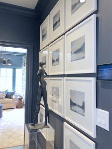
Across the massive hallway, very similar to the one seen downstairs, is a dark and lovely sitting room creating by Dana Wolter Interiors, LLC. I personally really love this back and white art gallery she created at the vestibule entry of the room. 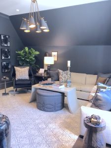 This Currey & Co. over head adjustable light fixture was also another eye catcher for me too. You can see a lot of current trends in this room from the nail head furniture, dark gray walls and layered coffee table pieces. A functional ottoman that can be moved to any space in the room but is stored under the coffee table for extra walk space.
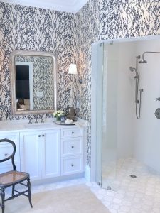 The on suite bathroom for this room is designed all in black and white to keep with the moody dark theme. Again you see flush mount tile with no threshold on the showers. The ever popular Moroccan shaped white Carrara marble tiles floors and white cabinets are still trending hot. These are all very classic design pieces, in my opinion so I feel like the bones in this space will have a lot of life expectancy and won’t trend out any time soon.
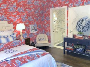
LAUNDRY ROOM/BEDROOM & BATHROOM: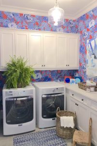 This is the upstairs laundry room for the home, which is the second laundry room in the house so it could be used as family laundry for small loads during the week. The convenience to have a laundry room located directly off of what will be the children’s rooms is super handy. It carries the same red and blue theme as the bedroom that it is attached too.
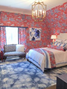 This red and blue Chinoiserie based design by Jena Salmon Designs, LLC is a feast for the eye. Jena created a layered effect by using matching wallpaper, drapes and bedding. Then she popped the space with a deco wool rug and greek key fabric on the bench.I personally am in love with that rug and the beautiful art work in this space.
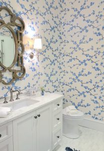
 You can see a complementary blue cherry blossom wallpaper was chosen for the bathroom which keeps the smaller space very light and airy. Another trend we are seeing throughout all the bathrooms right now is the resurgence of wall sconces. Just like the wallpaper movement, wall sconces have not made this big of appearance since the 80’s along with brass fixture, but right now they are super hot and what is old is now new again.
 Well this concludes our recap of the Southeastern Show house Tour. I hope you enjoyed seeing all the new trends and inspirations for homes this season. I have to say, I really hope that with the up turn in the building sector I hope to see more of these soon! I would really love to see the “Street of Dreams” home tours get started back up again; they were always my favorite and I really love the Southern Living Homes too!
These homes are absolutely stunning. This would make for such a unique date night/day date!
These homes are unreal! I am in love with all the detail put into each room. Even the landscaping and outdoor areas are fabulous…when can I move in?!
They have some pretty impressive designs and the fact that it is sold, and they have taken everything out and completely redesigned them blows my mind too!
They actually did a wine tour on Tuesday and Thursday during the week. I personally would have been petrified to walk through there with a glass of merlot, and spill it on a $35,000 rug, that was on loan!!!! Good lord!!!
These homes are just so beautiful, love all the details in every room and each piece of furniture. They all seem to have been curated so tastefully. I really like all the new trends you have compiled here, bookmarking this post for some inspiration I may need in few months.
It is a lot to take in for sure. Please feel free to visit as often as you like, it is the entire reason I wanted to compile this beautiful show home and it’s trends before it was gone.
What an incredible space! I have to agree with you, the breakfast nook was one of my favorite rooms as well, I also am in LOVE with the exterior of the home!
Hello, I think this home has a lot of wall paper in it for the times, and none of them match to form a flow at all. I am so glad as you stated below in comments that the new owners get a redo, some those choices are a little hard to live with on a daily basis, but still they are fun to see.
I think of it like going to fashion week, you can see all the creative new styles and trends. Then maybe you invest in a piece or two that work with your existing wardrobe, or in this case home, to make it pop for the season just to be on point.
What a beautiful home! I love the details of the design in each room.
Gorgeous with so much attention to detail. My favorite spots without a doubt … the loggia and the breakfast nook!
Loved the home and the decor. Loved each and every space. So pretty!
What a gorgeous home! I love the interior design especially the walls.
Wow, what an amazing thing to be a part of! Gorgeous pictures.
Wow so much detail and beauty isn’t he Southern home!