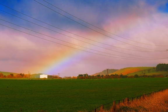
Rainbow Connection Investigating Color Psychology
I have always been fascinated with the Rainbow Connection Investigating Color Psychology, since my college days.
Rainbow Connection Investigating Color Psychology, was one of my absolute favorite college classes, that I took during my interior design studies. Today I would like to share what I learned, in hopes that it will some day help you. Maybe while decorating you home, picking a paint color, or even deciding what to wear.
R O Y G. B I V
Meet Roy G. Biv the most common acronym for the shades of color and where it all starts. Red, Orange, Yellow, Green, Blue, Indigo and Violet. Color is used everywhere and invokes emotions in us, sometimes we are aware of the emotions and other times it is more subtle. The most interesting documentary I ever saw regarding color was a blind case study. The subjects put on a black capes and were then asked to hold there arm straight out away from there body, like an airplane. What each client did not know was that each cape was lined with a specific color from the color spectrum. The video footage was astounding as the people would hold there arms out each time thinking they were level and straight they were not. Their arms were actually higher, lower, or even off kilter, based upon their bodies reaction to reading the color sewn inside the cape. The results were consistent for the same colors over and over again. This study proved that our bodies read color with out seeing the actual color, which is simply amazing to me.
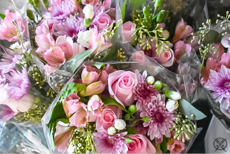
PINK
Is known as the pretty color, and it just makes you feel good about yourself. As the a lighter shade of red represents love and romance, as well as femininity. It is also used in a lot cosmetic branding for this reason, like Mary Kay with the pink Cadillac’s. Pink is generally considered to have a calming effect. It also represents sweetness which could be literal as in sweets, or baked goods, like Duncan Donut’s or in the girly sweetness of a baby girl.
Sub Category Colors: Rose, Fuchsia, Blush, Watermelon, Magenta, Bubble Gum, Salmon, Strawberry, Ballet Pink, Hot Pink, Peach and Coral.
RED
Can represent danger, warning, or error. Think about a stop sign, poisonous snake, or a fire alarm. I personally noticed that when I drove a red car I felt like people would try to hit me or aim for me. Red also represents warmth, love, passion, or intense emotion as seen by the use at Valentine’s Day with hearts and roses. It can also symbolize bravery, war, or blood, and can improve accuracy on certain tasks. Some studies have shown red to stimulate appetite, creating a “must have more” sensation. This is why you see so much red in restaurant marketing think McDonald’s, Pizza Hut, Chick-fil-A , Arby’s, KFC, and countless others.
Sub Category Colors: Crimson, Ruby, Current, Scarlet, Merlot, Candy Apple, Garnet, Cherry, Brick, Wine, Lipstick Red, Mahogany, and Sangria
ORANGE
Is derived from a combination of yellow and red, so it is also a warm, stimulating and attention-getting color. However orange is associated with being cheap, or more of a value brand. Think about hotels for a minute. The Four Seasons, a very elite hotel’s logo is solid green. If you add orange to the green logo you get the Howard Johnson logo, which is a lower value hotel.
Sub Category Colors: Tangerine, Sweet Potato, Marigold, Ginger, Rust, Amber, Marmalade, Clay, Fire, Cantaloup, Pumpkin, Bronze, Sandstone, and Apricot.
YELLOW
A bright sunny color that is attention grabbing. Most people think of yellow as a happy color, yet studies have also shown, ironically, that prolonged exposure to yellow makes people nervous, causing adults lose their tempers quicker and babies will cry more. So it’s not good for a nursery. Yellow is also the most fatiguing color to the eye, and tends to aggravate senior citizens or Parkinson’s patients by causing them to shake more violently. I do find it funny how most schools and hospitals are usually painted a light shade of beige-yellow. Which is probably the worst possible choice for these types of environments.
Sub Category Colors: Dandelion, Banana, Honey, Butter, Canary, Gold, Butterscotch, Blonde, Pineapple, Mustard, Sunshine, and Lemon
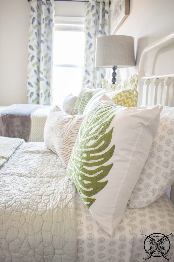
GREEN
Green is generally a physically soothing color that may simultaneously produce an emotional lift. Green is commonly associated with nature, and also signifies good luck or money. Green adds a certain amount of quality or richness to a product. It is a very elite color, however it also has an extreme catalyst, green is always associated with envy.
Sub Category Colors: Olive, Emerald, Lime, Chartreuse, Sage, Sea foam, Moss, Mint, Pistachio, Pine, Army, Pear, Seaweed, Basil, Shamrock, Pickle, and Crocodile.
BLUE
Blue is considered serine and seen as having a calming effect great for spa’s, and pools. Darker shades of blue note a trustworthiness and may suggest reliability and security, often used as in police uniforms and men’s business suits. Blue is often mistakenly associated with sadness. The thought of feeling blue, but studies suggest that the color blue can increase productivity and creativity. It may actually lower body temperature and pulse rate.
Sub Category Colors: Indigo, Cobalt, Cerulean, Navy, Sapphire, Denim, Peacock, Sky, Teal, Aegean, Azure, Ocean, Lapis, Spruce, Blueberry, Royal and Arctic.

PURPLE
Purple has always been associated with royalty, along with wealth, and luxury. As far as the chakras go it is highly spiritual color full of wisdom. Purple has an exotic flair, sometimes overly so, make it a fantasy color. Purple is associated with mystical or magical themes. Therefore, in some instances purple can appear out of place, artificial or even fake.
Sub Category Colors: Eggplant, Lilac, Plum, Violet, Lavender, Grape, Heather, Raisin, Orchid, Boysenberry, Amethyst, Wine, Jam, and Mauve.
Meet The Neutrals:
BROWN
Brown is a consoling color and less stimulating than all the others. These earthy colors can suggest strength and security along with wholesomeness, reliability, durable, and secure. Browns alway give the feeling of being rooted or grounded like trees, rocks, minerals and other natural things of the earth. As the shade gets darker it adds a quality of richness, think of chocolate or coffee.
Sub Category Colors: Mocha, Chocolate, Cinnamon, Brunette, Cedar, Pecan, Coffee, Walnut, Caramel, Hickory, Umber, Gingerbread, Peanut, and Tawny.
BLACK
Represents death, mourning, and evil things such as the grim reaper, witches or Darth Vader. However, it is also a color of sophistication, such as formal wear, “a black tie affair” or represents authority, like a judge’s robe, or graduation gowns.
Sub Category Colors: Onyx, Ink, Raven, Midnight, Coal, Ebony, Charcoal, Sable, Jet Black, Obsidian, Soot, Pitch Black, Oil and Crow
GRAY
Gray is literally a “middle-of-the-road” color, gray is a practical and timeless. It can also be construed as dull, boring or even depressing when used in excess. Gray causes the least eye fatigue of any color on the spectrum.
Sub Category Colors: Cloud, Graphite, Iron, Dove, Pebble, Flint, Fog, Slate, Smoke, Silver, Pewter, Shadow, Ash, Stone and Fossil
WHITE
White represents purity, innocence, and goodness. White makes a room seem brighter and more spacious, but too much white can have a sterile, cold effect. It is always equate to the good guy, heaven or angelic.
Sub Category Colors: Pearl, Porcelain, Parchment, Ivory, Cream, Bone, Frost, Alabaster, Snow, Eggshell, Cotton, Linen, Daisy, Rice, Coconut and Chiffon.
JENRON DESIGNS does not sell our subscriber list. We also respect your privacy and will not spam you. A once a month newsletters to keep you in “the know” you can subscribe here.

The interesting thing is that colours represent different things in different cultures. For example, in some Asian cultures white colour represents death and bad luck! I find it really interesting.
Funny that I am always seeking calm and I gravitate naturally toward greens in my home. Who knew?? <3
This is so interesting to learn about what all the color represent, beyond the obvious things. I was also surprised to learn about grey being so easy on the eyes – I guess that’s why the paint trends lately have been all about grey walls with white trim!
This is so interesting and makes me want to learn more. I love the break down and they seem so accurate. I guess I’m orange all day. It’s funny to see red as danger because most of us see it love. I’m definitely sharing this !
Maddy I am the same way I go toward side side colors in the blues and greens myself. I guess I need some calming effects in my home LOL.
Anissa, thank you for sharing. I agree with your the break down is fascinating.
Hey Cara thanks for stopping by 🙂 You are right on the money about the grey I think society is craving the neutrality of it. In a world full of bright flashing media, people need a place outside of there devices to rest there eyes.
You are so right Lina, where in the US it represent purity and cleanliness, in other cultures it represents death and bad luck. Thanks for stopping by 🙂
This was an interesting post. I had never thought of orange being associated with bargain brands. But when I thought of it, there were definitely associations that went that way!
I am right there with you Kyla. I was absolutely shocked when I read that color trait, then the more I thought about it the money it made sense, Hobby Lobby, Big Lots, Home Depot, just to name a few. The text book example from school was the Waldorf Astoria (all green) verses Howard Johnson (green and orange). LOL that one stuck with me.
This was such an interesting read, thanks for sharing!
i enjoyed reading this! i love colors and knowing the explanation behind each is so interesting! a great reference when designing and setting a certain mood!
This was really fun to read! I LOVE colour, my favourite being green – but maybe pink would be a better colour for me because it is calming, and I have anxiety issues 🙂 . The emotions and things associated with red really surprised me! I remember reading once that marking someone’s answers wrong with red ink can actually be quite emotionally damaging. So interesting. Thanks for this amazing read 🙂
Hi Nicole, thanks for stopping but and leaving me such a nice comment. I am so glad that you enjoyed this post 🙂
I have always been interested in colors and loved reading this Jennifer! Now I don’t have to research, you answered many questions I had about colors.
I absolutely loved this. Rainbows make me so happy 🙂 My favourite colour is purple just because of what it represents the mystical and magical 🙂 Blue is also one of my faves as it reminds me of the ocean and the ocean calms me so much. Such a fun and educational post.
I really love green, it has a peaceful effect on me.
Great post very interesting to learn the secret meaning behind color and it’s subconscious meanings.
Jennifer I love this entire post. I think it showcases your interior design background, and proves that you have knowledge and creative talent. I learned to much in just an afternoon.
This is a very interesting topic, I can see how you were drawn in to study more about it. I personally love to wear a lot of blue but I have never decorated with it, maybe I should. A calming effect would be nice around here, lol.
I have really enjoyed learning all about color this was very interesting. While I love all that you do, I would love to see you do more post similar to this one.
I learned so much from this article. Things I have never really thought about before. Thanks for broadening my horizons.
I learned so much from this post. My favorite color is pink and I agree that it does make me feel pretty and sweet. Thanks for sharing.
Hey girl I really loved this post. I feel like I learned so much that I did not know. It is interesting about green, directly relating to money, such a subconscious thing.
Jen, this was a really informative post. I feel like I learned so much more about color, than I had even given thought too.
Color has always be a big thing for me. It is cool that you really get it, and are educating people on how much more color really means.
I did not know that color had so many meanings. I guess it takes sense, flowers have meanings and so do birthday stones, so why not colors in general.
This may be one of my favorite posts to date. I have always be intrigued by color and how they effect our mood, mindset and sub-conscience. Great job on this one!
This was very educational and interesting. I will have to keep this in mind when designing color to go in specific rooms. I guess that is why you got a degree in interior designs and I am a decorator….lol, just kidding your post are the best!
Love blogs where I actually learn something. I never knew that color meant so many different things only how they made me feel inside.
This is fascinating, I can see why you enjoyed studying this is in design school. I am obsessed and want to know more myself.
Another great post Jen. You always keep your readers interested in what you will write about next, and that is a good thing.
I have to say I found this topic to be very interesting. I must admit I have never really given it much thought until now.
Very cool, I love yellow and I had no idea that it was a nervous color and caused so many side effects to people. It is funny how all the classrooms at schools are always yellow, I guess that a bad call, maybe a nice blue, eh?
I had no idea there was so much subliminal messaging going on with color in advertisement. This is very interesting, and eye opening.
Well you know I am a pink fan. I love that it symbolizes sweetness and beauty. I hope they up date it to be united with courage too!
This was a very interesting read for me. Thanks for all the great information, I feel like I learned so much about something I had no I dear I wanted to know.
A informational read for me, I am now so interested in learning more about this. Thank for sharing you schooling with the rest of us.
In my culture we celebrated orange, as a color of joy. I had not notice the the commercial applications of the color before to express value or savings, but you are correct. Very interesting.
Red has alway been my favorite color it is interesting to see that it causes anger and desire, what a complex color. Thanks for the info.
I really loved this post I feel like I learned so much about color theory. Thanks
WOW I did not know that color effects our judgements and decision making, this is really cool. No wonder you loved studying about this is school.
Great post Jen, I really did learn a lot. Maybe I just never thought about color from this view point before, but I feel so enlightened now.
Oh I just learned a so much, thank you for such a interesting post to read. The ones that explore topics that are unique really drawn me in and I want to read them.
You have really created a fantastic post, in fact I really wish I had thought of it. I remember taking a class on color theory, however it was not as in depth as yours.
Love this post, it really explains a lot of ideas about color and even a few misconceptions.
I am a big fan of the blues, and I can see why since they promote serenity and calmness. I need that in my down time. Thank you for posting a educational article like this one, I just love the variety you offer to your readers.
Wow now I will look at colors so differently. It is not just purple it is the color of royalty.
I enjoyed learning all about my favorite color green. Something I knew but I had no idea the way it relates to quality, I had alway heard jealousy, like the green eyed monster. Guess you learn something new every day.
Such a pleasure to read this post, I do feel like it was a good use of my time and that I learned a lot from your knowledge. Thank you.
Great post, filled with so much knowledge on color. You would make a great teacher, I have learned so much from your site over the past year.
I have never really thought about the way color my effect decision making or moods, but it makes perfect sense. If weather can effect our metal state so can seeing a pretty color.
I love anything in the blue tones, mostly sky blue or turquoise. I guess I need more calming vibes in my life ha ha.
I am really enjoying this article and I am blown away by all the information I am learning. As a psych major we touched upon the ideals of colors and the effect on moods. I love that you are putting it into practical knowledge.
This was such a fun post I really loved it and feel like I actually learned something. 🙂
As a baker I design a lot if cakes with color, it is interesting to apply these theories based on what I sell the most of during a day. Lots of pink icing items for sure!
I decided while I was here to check out a few of your other posts too. This one really peeked my interest and I found learning about the psychology of color very satisfying. Great site, keep you the impressive work.
I saw this link on stumble upon and just had to read further. Great information and very enlightening too.
I love all the colors and anything to do with color. So this article was a perfect little read for me, I had no idea there was so much underlying messaging with colors. It makes sense when you think about it, in the animal kingdom red is a warning sign meaning to stay away from and a deterrent for signaling danger.
Who knew there was so much to learn about color and the messages that they send. I need to take this int account when picking out my clothes for the day. LOL
Thank you for such a interesting read, I can tell you have a lot of knowledge in this area. I really appreciate how you chose topic to write about, it is as if you sharing a little piece of you passion with your readers.
I wanted to let you know I really enjoyed reading this post a whole bunch. It is very interesting to lar about how color effects us on a sunconscience level. Clearly it is posts like that this that showcase yoir design background.
Very interesting post, I rally loved learning more about color and their meanings.
Red is my favorite color I am surprised that it represents such anger and lustful ideals.
Okay this was very interesting, I have always be drawn to the sea and sea tones of blue and green now it makes sense why.
I had no idea that we read so much into color, whether we realized it or not. Eye opening read now I will look at the world little bit differently.